
Sour Power Sortz
Brief
For this assignment, we selected an off-brand or poorly designed Dollar Tree product for a redesign. The goal is to expand to expand from the dollar store into the Howard University C-Store to increase sales and attract a new audience, university convenience stores. I chose Dorval Trading Co.’s Sour Power Sortz as I felt the abundance of colors and inadequate spacing could be improved on. The specifications for the project are that the company’s logo must stay the same, the packaging must be functional, and both physical and digital mockups are required.
Overview
Dorval Trading Co. has been around since 1966 and is known as a pioneer in the sour segment of candy. This redesign is aimed at keeping the fun, comic-esque concept of the original, but organizing the text, colors, and imagery in a way that is cohesive and visually satisfying. This design is for Howard University students who visit the several convenience stores on campus. The message I intend for the audience is that boldness doesn’t have to be overwhelming.
Timeline
September – October 2025
Scope
Packaging Redesign
Role
Graphic Designer
Sketches
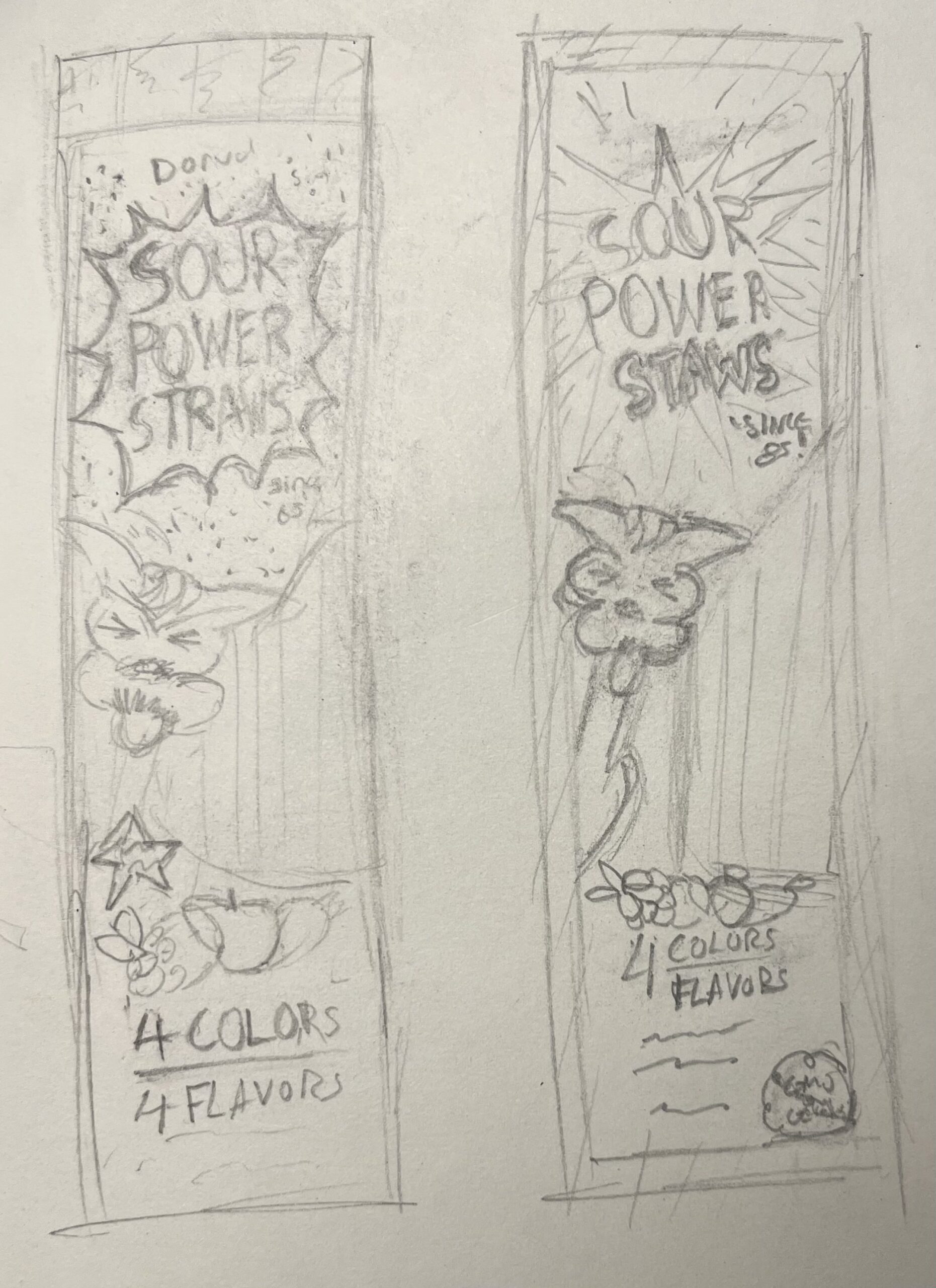
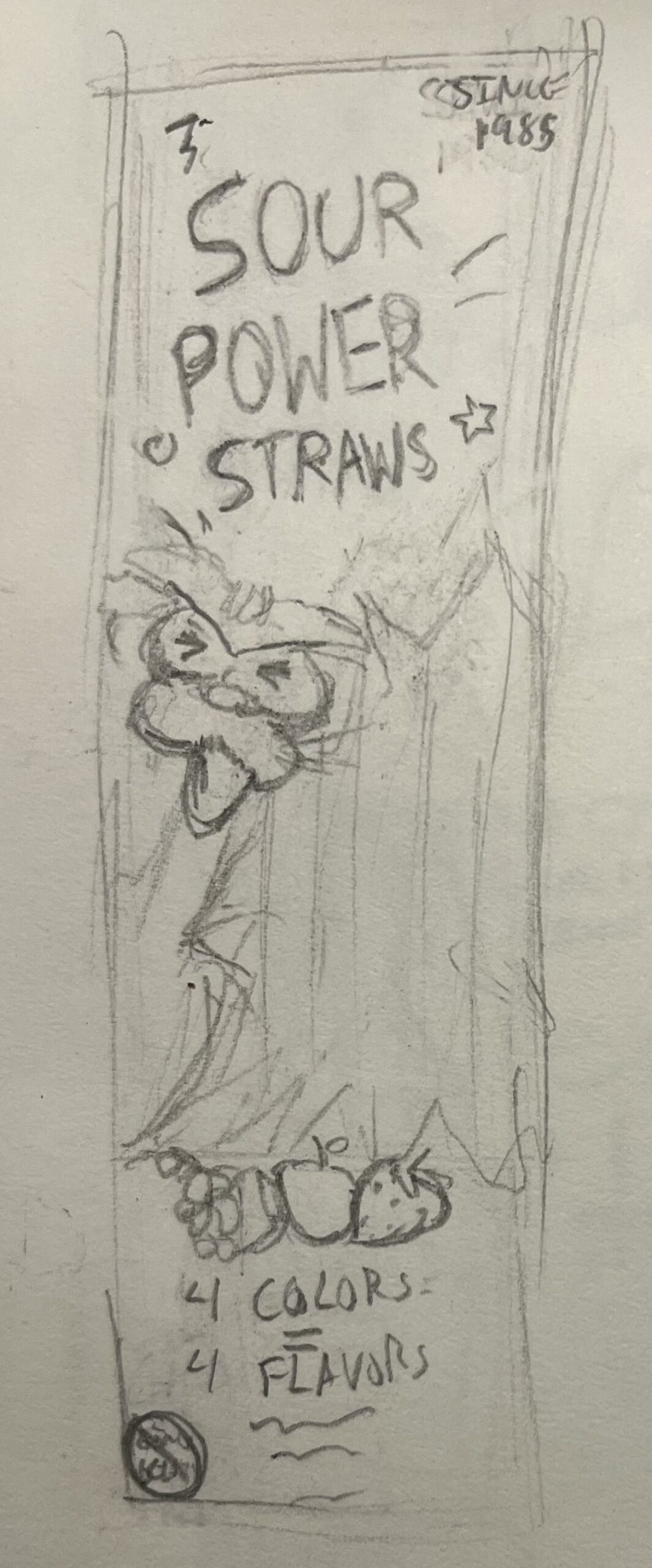
My first sketch included dots to represent a halftone pattern that dominated the top half of the package, with inspiration drawn from vintage comics. The original type treatment of the logo caused the words to not only bulge and overlap but trail outside of their boundary, so I adjusted the sizing of the speech bubble. Instead of bold colorful lines overwhelming the packaging, they’re reserved for the top and bottom edges. I also changed the arrangement of the 4 Colors/4 Flavors text, removing the unnecessary warping, white background, and stacked them vertically to improve spacing.
My second sketch diagonally shifted the lines into a border around the bag and displayed the 4 Colors/4 Flavors text as a mixed fraction. My last sketch dropped the spiked speech bubble completely, instead it incorporated a transparent section with the bubble shape to reveal the straws.
Digital Flats
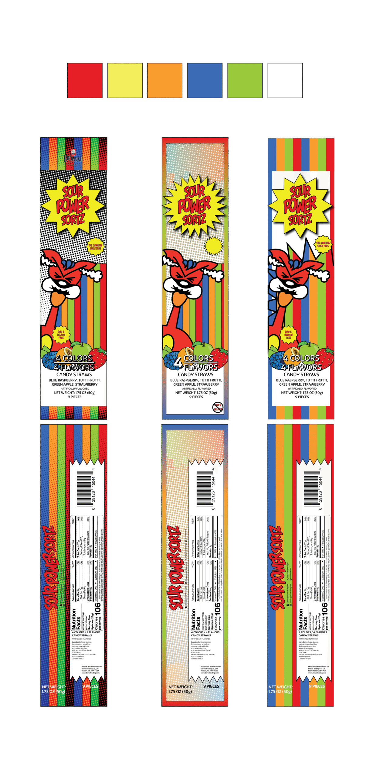
As all the options were similar, my professor suggested I digitize all three. I decided on my first sketch as my final because it felt like a strong balance of the original design and my own. Initially, the halftone wasn’t going to be applied to the edges but the repetition helped create rhythm for the consumer’s eyes to flow across the package. My goal for this redesign was to organize the chaos, I didn’t feel that the design or branding itself was poor; it just needed to be executed better. I adjusted spacing throughout texts and imagery to provide breathing room and allow for a clear focal point, created a halftone texture to maintain the playful feel, and rearranged the description of colors and flavors to reduce clutter.
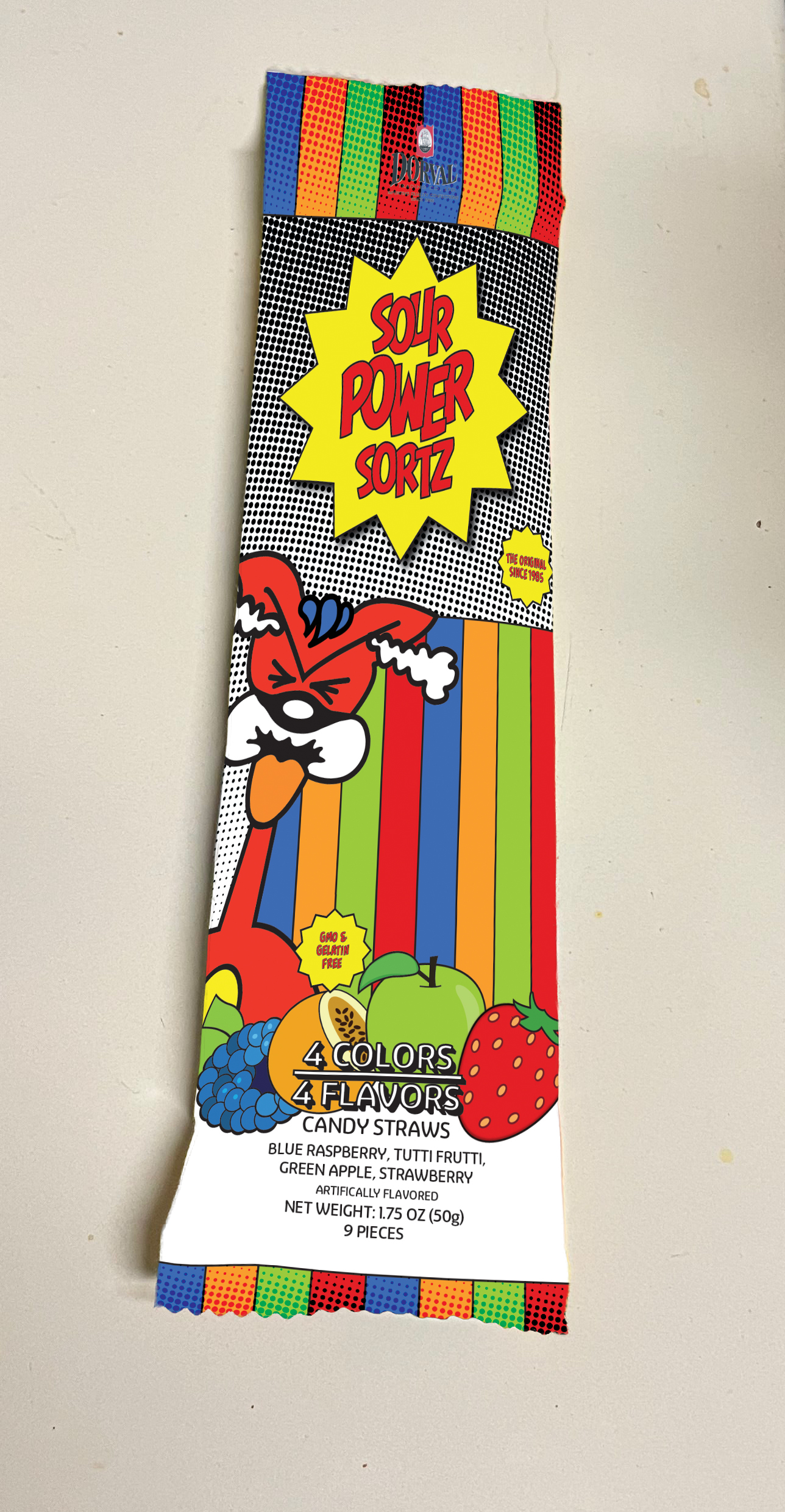
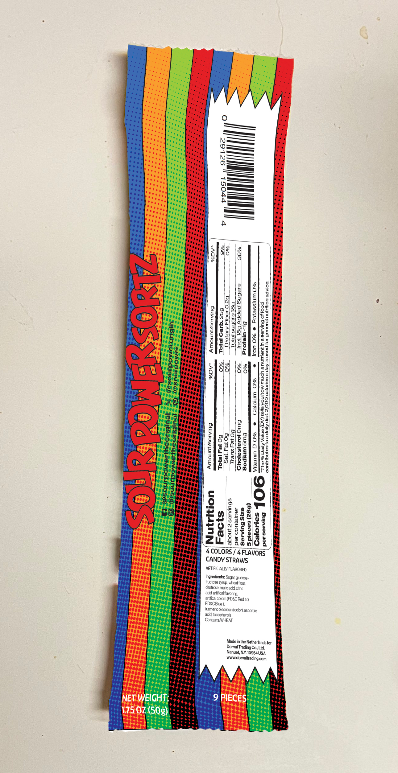
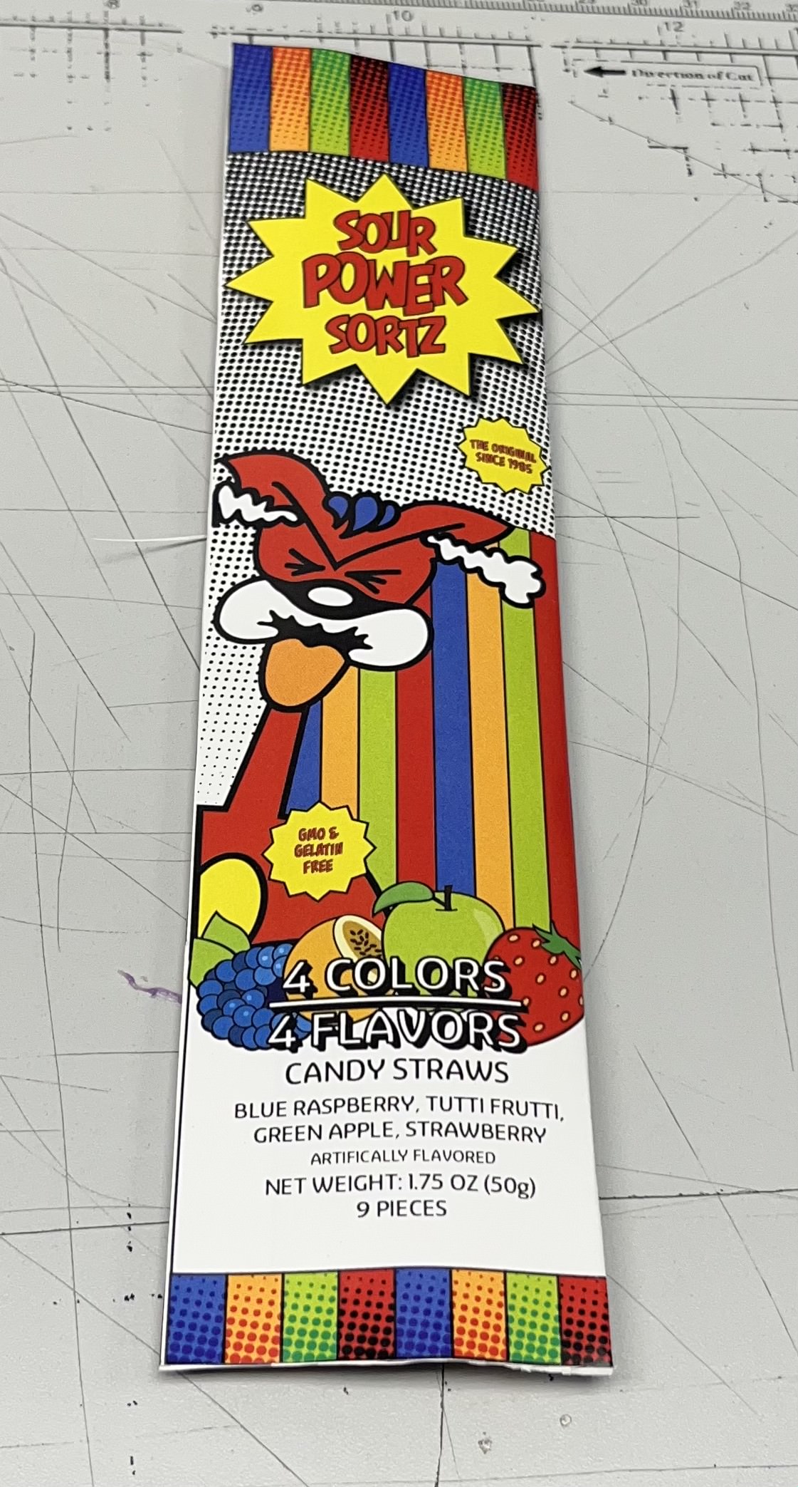
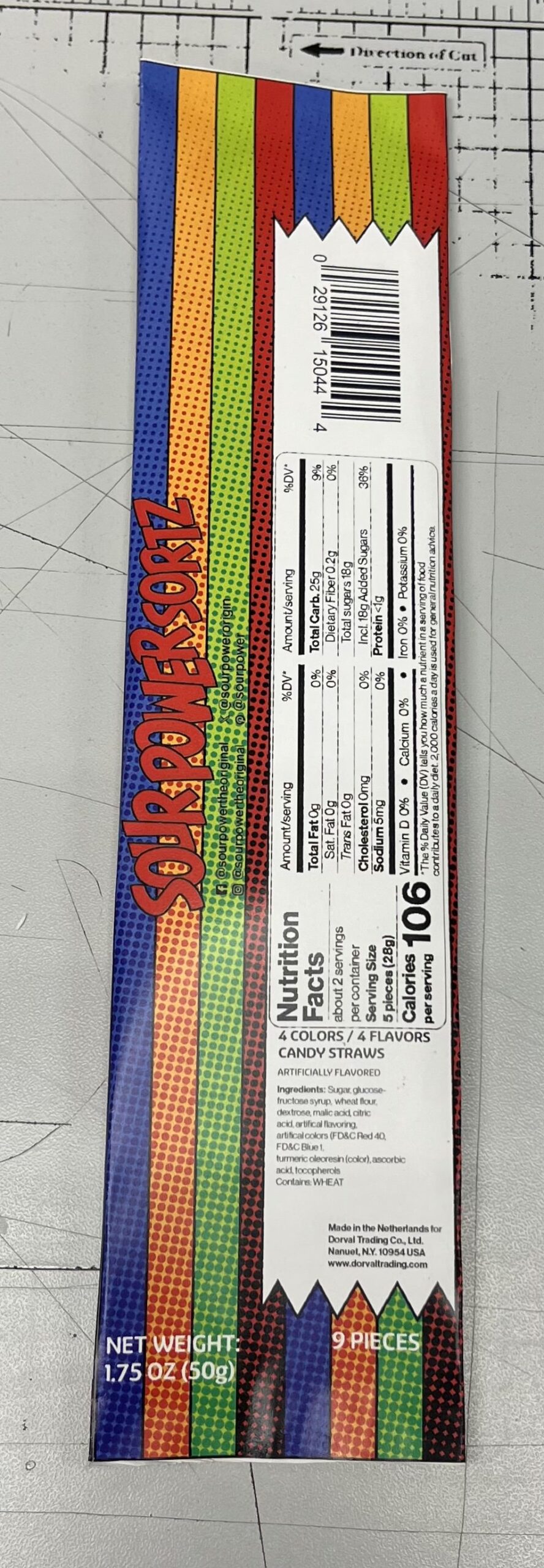
Digital + 3D Mockups
My packaging didn’t allow for a premade mockup, so I improvised and took pictures on my stovetop. Since I had to make my own blank packaging, I overlaid the bag with white. Next, I made a rectangle slightly bigger than the bag, converted it into a smart object, and warped it to conform it to the contours. From here, I simply added my image files and clipped them to the white layer below. For my 3D mockup, I added half an inch of white space to fold the packaging and then I glued the space and the inside of the front to seal it. Lastly, I added a bit of glue to the top and bottom edges of the package to mimic the original.