
Howard University 91st Annual Student Art Exhibition
Brief
Every year, the College of Fine Arts at Howard University hosts a student exhibit open to all Art majors and their respective concentrations/mediums. One student is selected to develop print materials for exhibition promotion.
Overview
While interning for the university’s art gallery, my manager and an assistant chair of the department of Art requested a promotional poster and brochure. I was assigned to create a unique logo and apply cohesive branding to each component.
Timeline
February 2025
Scope
Logo Design
Print Design
Print Design
Role
Graphic Designer

Process
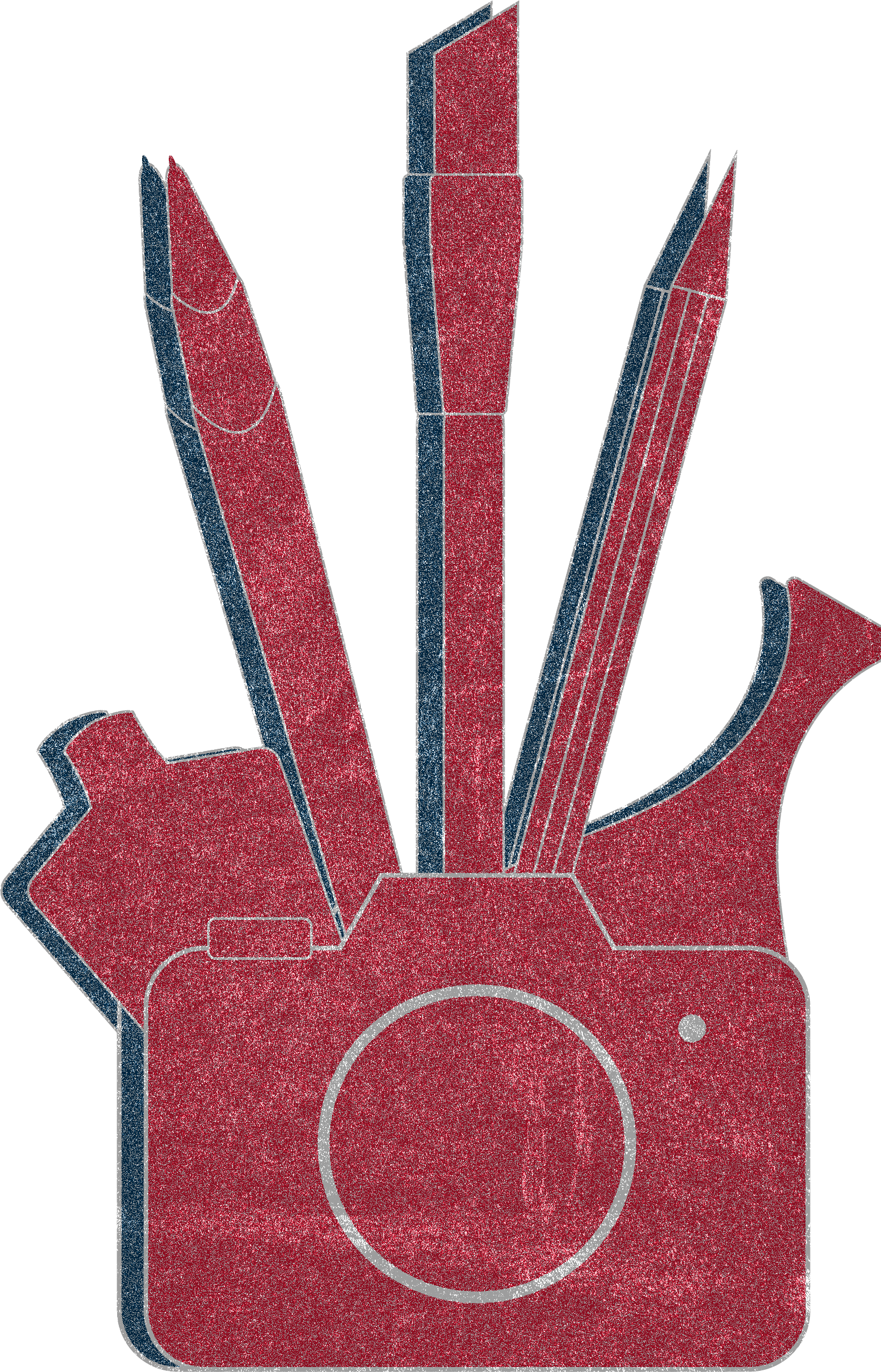
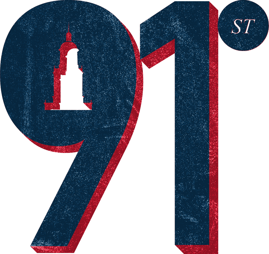
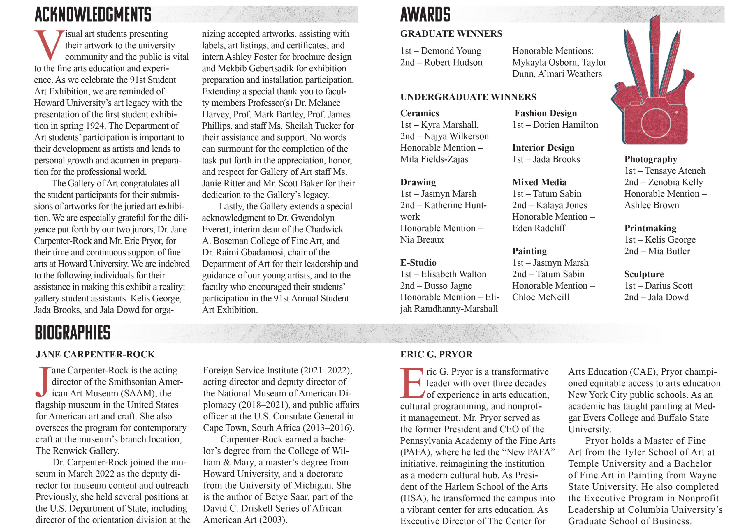
Initially utilizing a photograph of the Founders Library clock tower, I collaged and colored the result with the school’s colors. However, I was encouraged to deviate from recognized icons and lean into heavier abstraction to develop something truly distinct. Looking through the categories, I grouped those with the most competitors and developed symbols for each in Illustrator. Starting off with a camera in the foreground to represent photography and printmaking, from left to right: a mannequin (Fashion), stylus (Electronic Studio), paintbrush, pencil (Drawing), and vase (Ceramics/Sculpture). Still hoping to find use for the clocktower, I replaced the negative space in the 9 with a silhouette.
Outcome
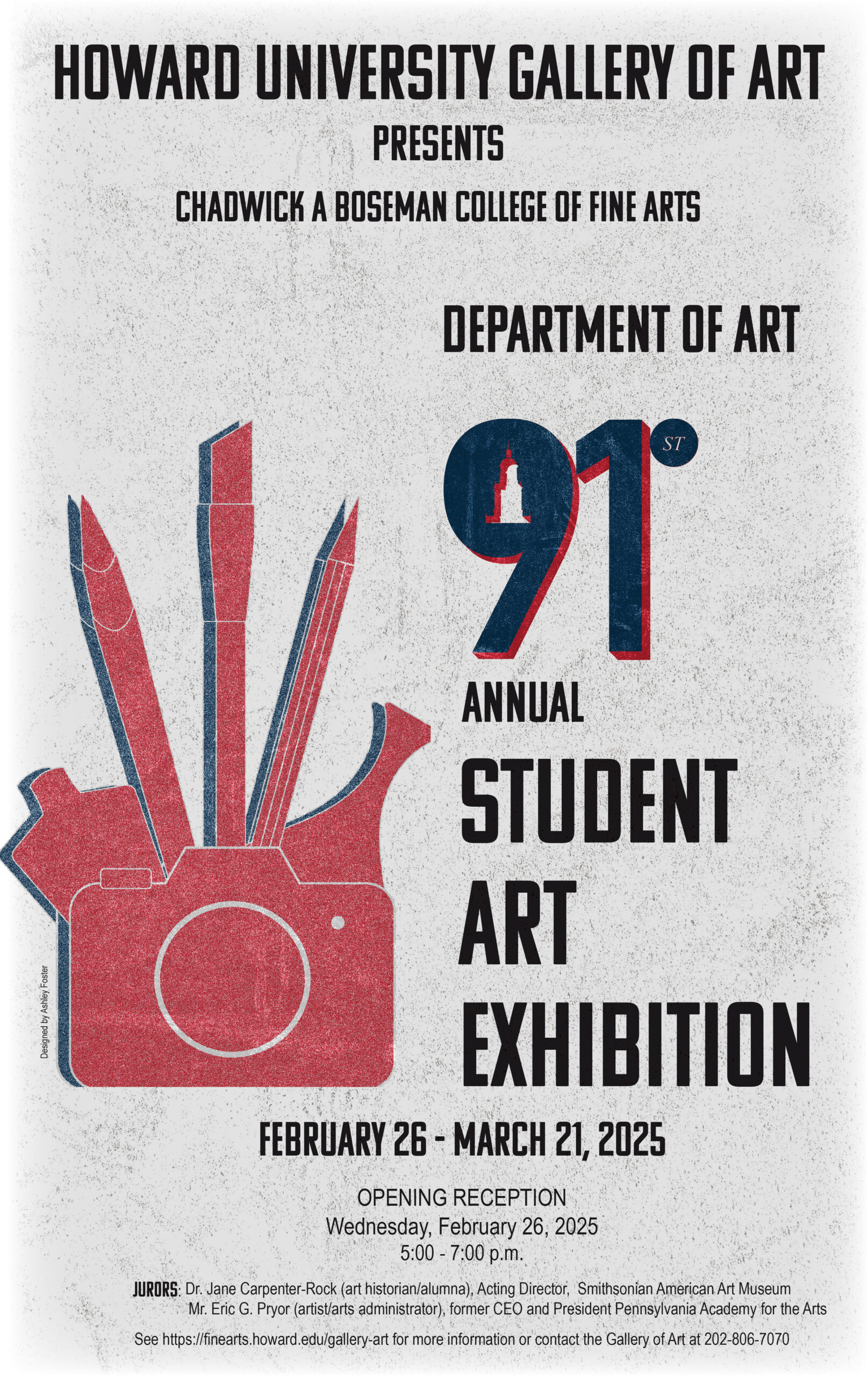
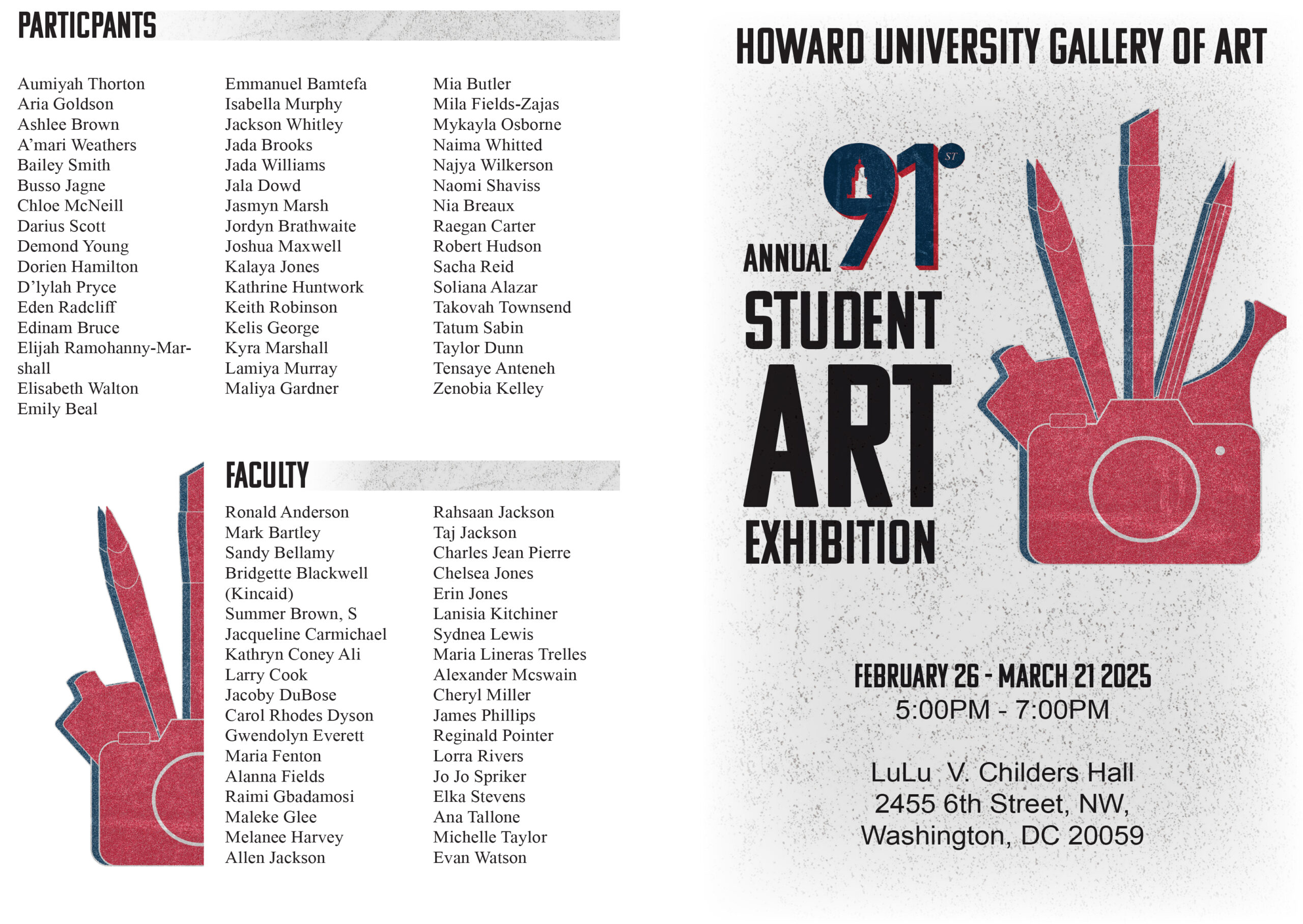
Once the logos were completed, each were overlayed with a gritty texture. The goal was for the poster to have a letterpress feel to it, so a similar texture is layered on to the paper. Distressing elements with “dirty” textures allows for a shift from the cleanness of digital work and offers a bit more personality. Finally, I feathered the edges of the poster and section headers to balance out the harshness of the grain and scratches. This project reinforced my understanding of the importance of revision, accepting professional feedback/criticism, and working to meet deadlines. Being able to contribute to a long-term tradition and leave my mark at Howard made the work very fulfilling despite the sudden request paired with a strict due date.