Mini Scientists
Brief
A semester project dedicated to crafting a brand package for “The Event”, a three day experience, offering a dynamic weekend of activities tailored to engage the target audience. The goal of this project was to develop a comprehensive brand and marketing campaign that effectively communicates the event’s identity, attracts attendees, and enhances the overall experience. The campaign was required to include a cohesive visual identity, print and digital marketing assets, merchandise, and a digital presence through a dedicated landing page and event app.
Overview
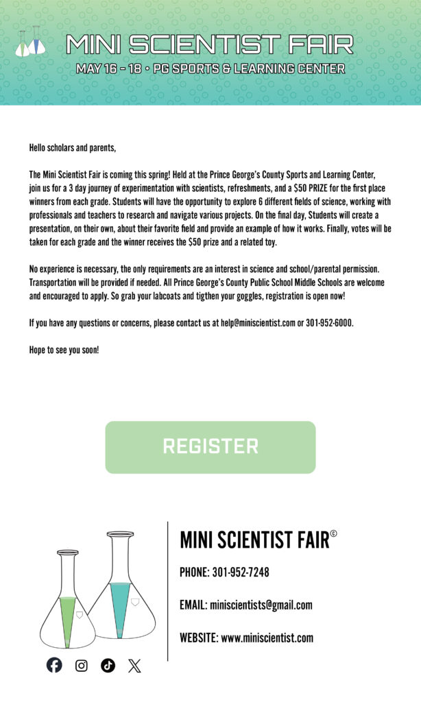
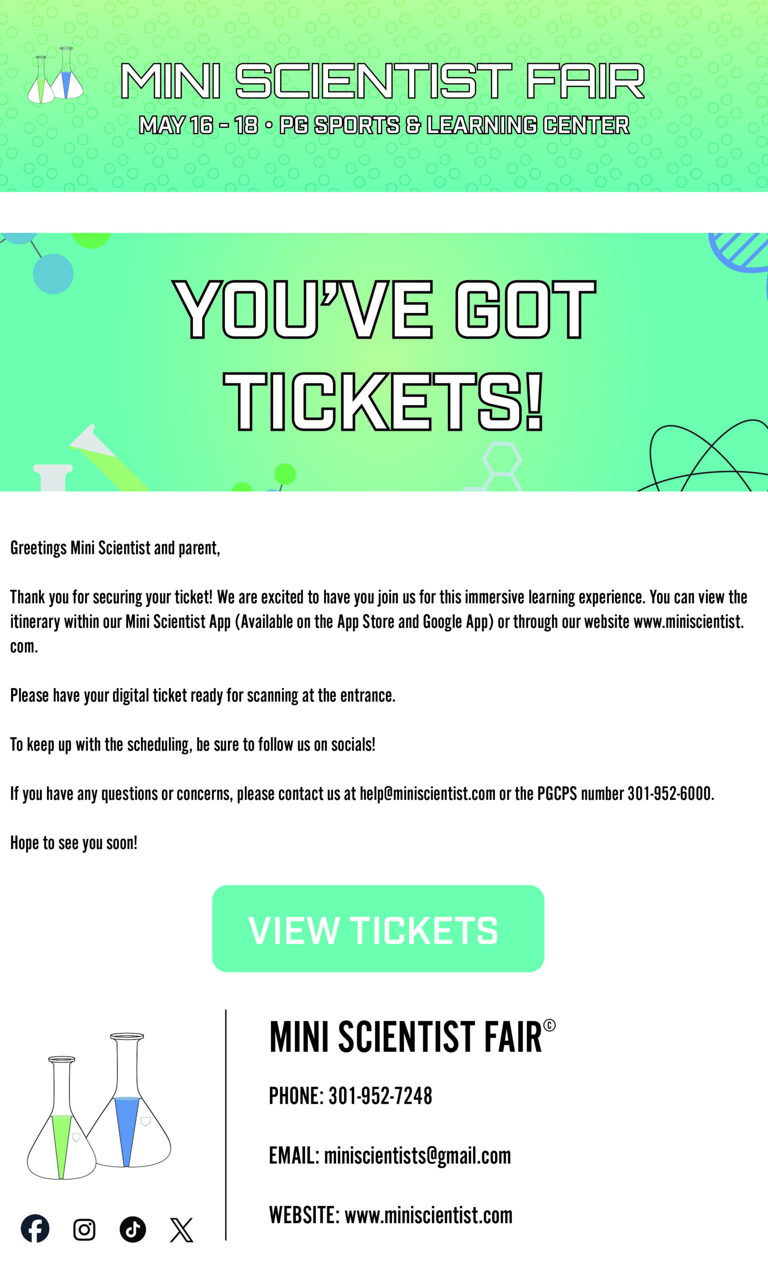
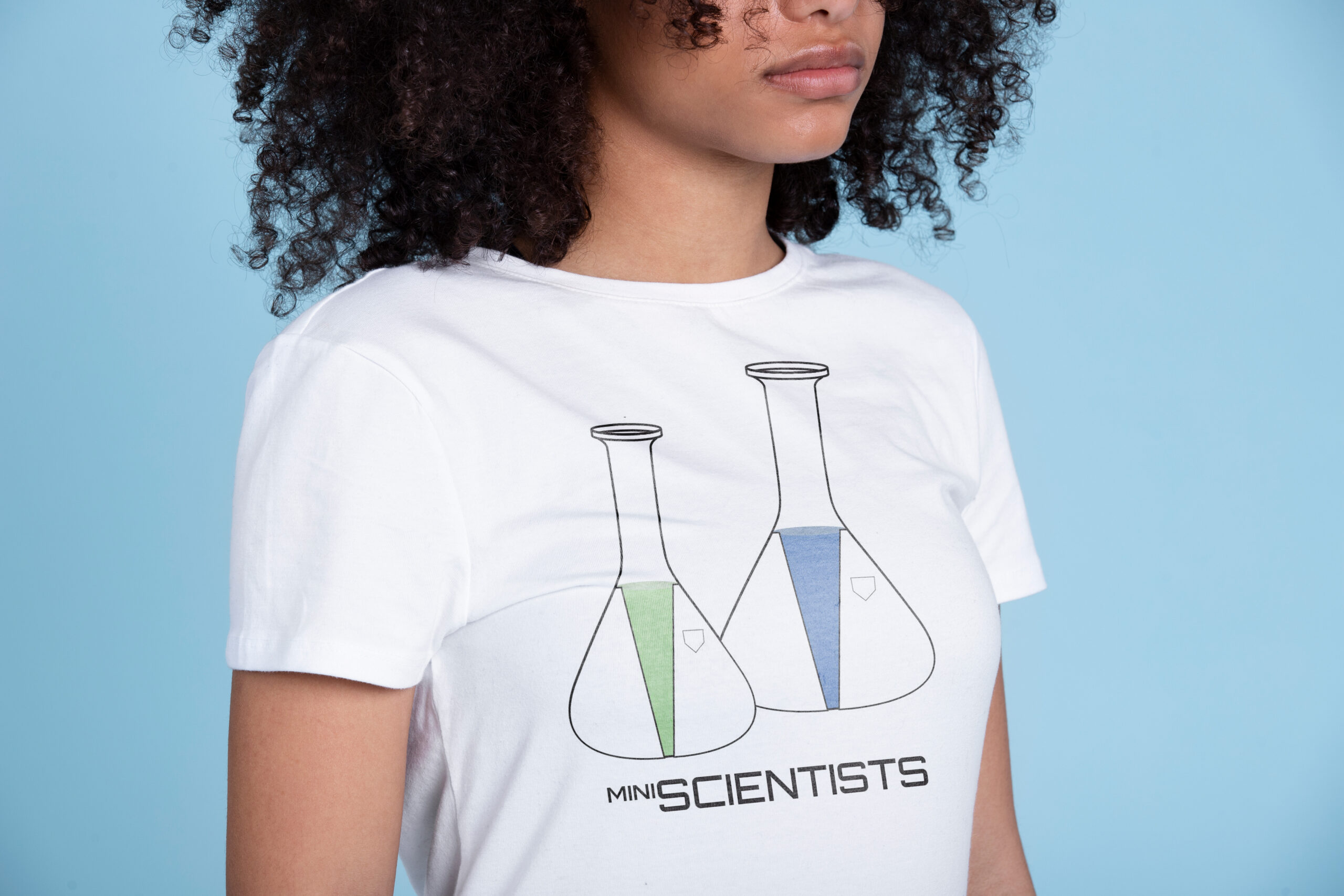
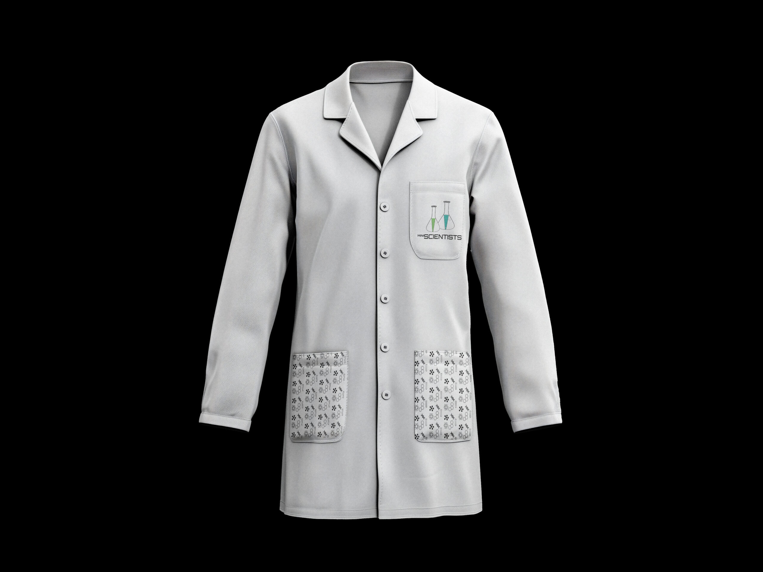
The event I received was a middle school science fair, making my audience both students and parents. Over the course of the semester, I created an engaging and cohesive visual identity for the fair, designed a variety of print and digital collateral, produced event-related merchandise, and developed a landing page website and an event app to enhance accessibility of event details.
Timeline
January – May 2025
Scope
Brand Identity
Logo Design
UI/UX
Logo Design
UI/UX
Role
Brand Designer
UI/UX Designer
UI/UX Designer
Typography & Palette
Process
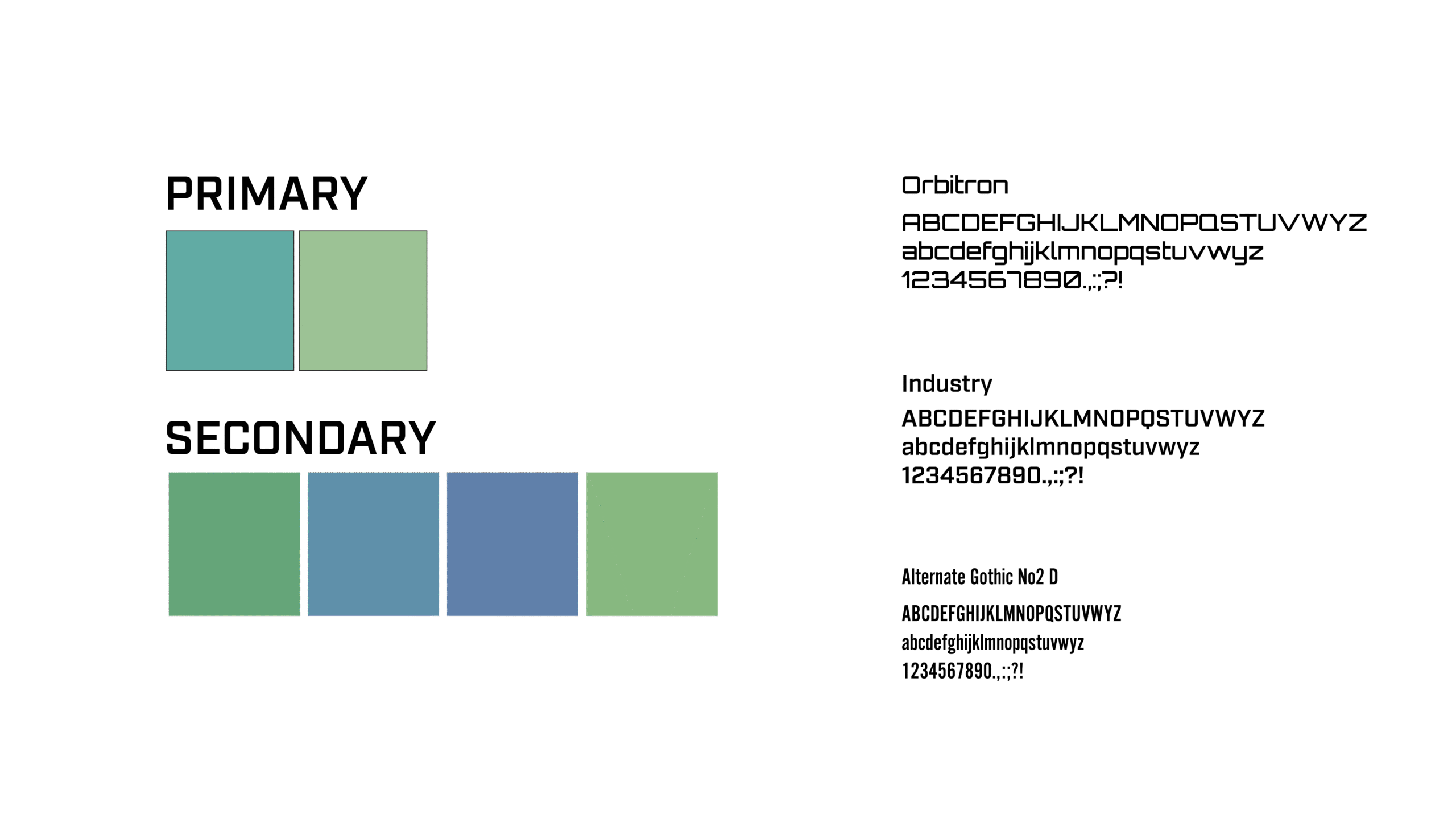
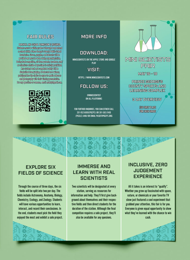
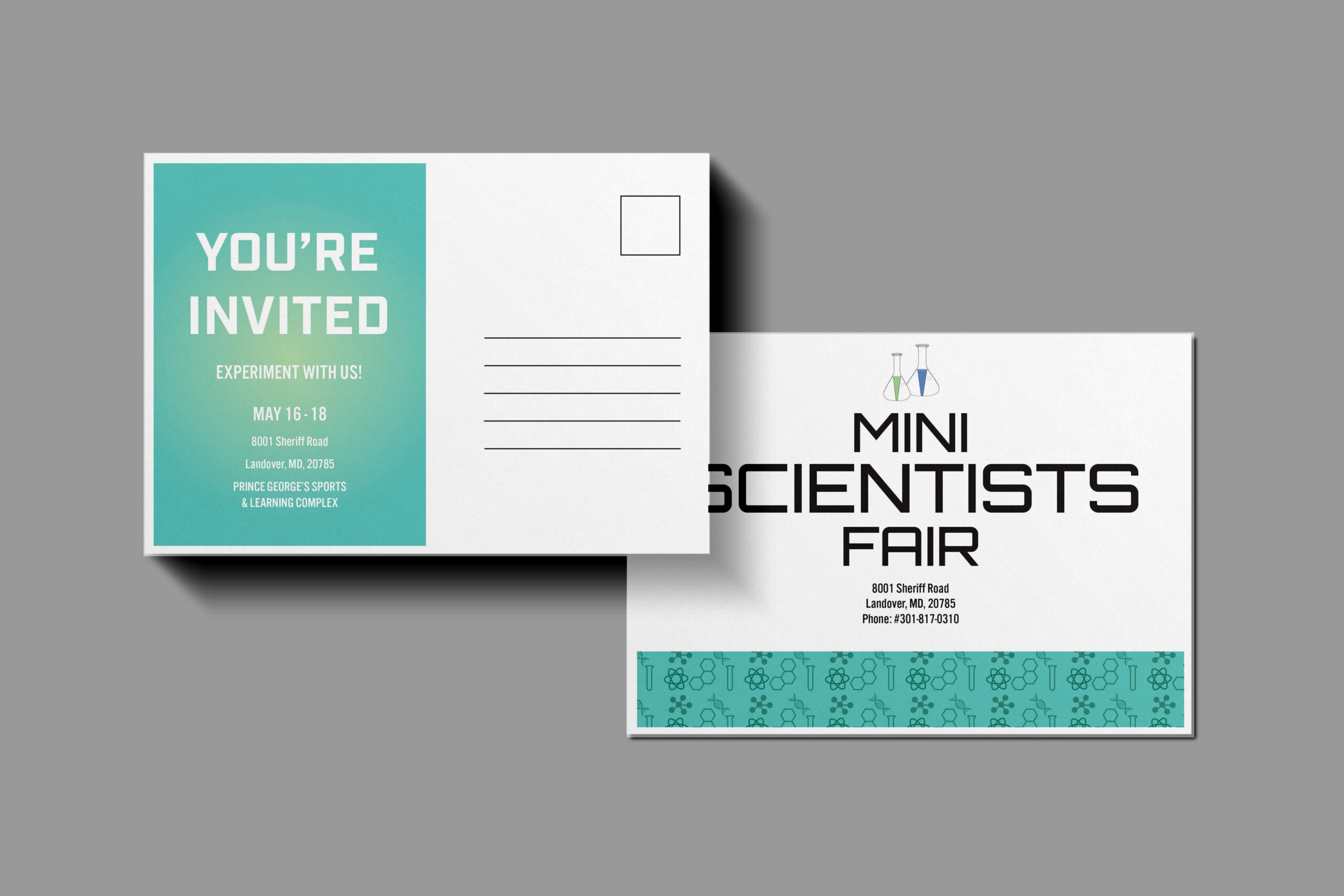
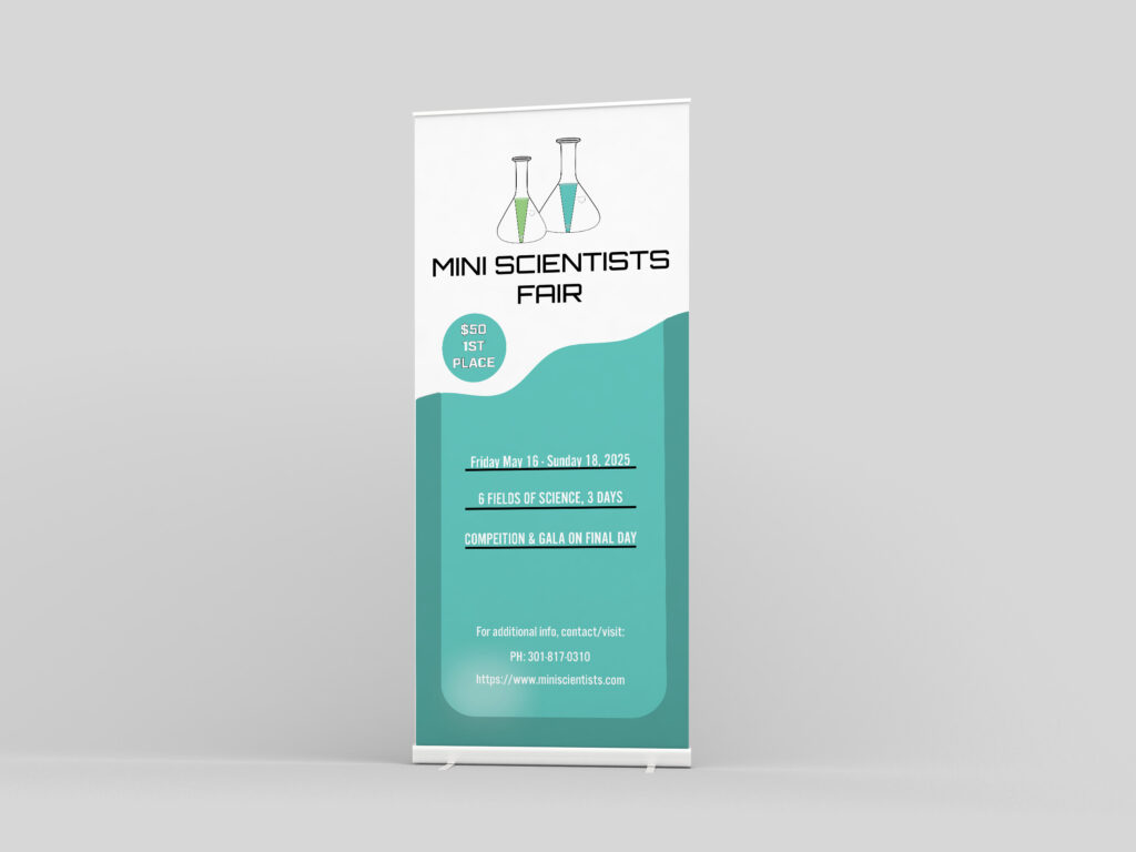
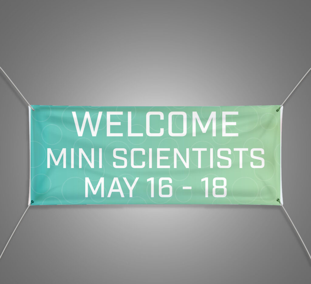
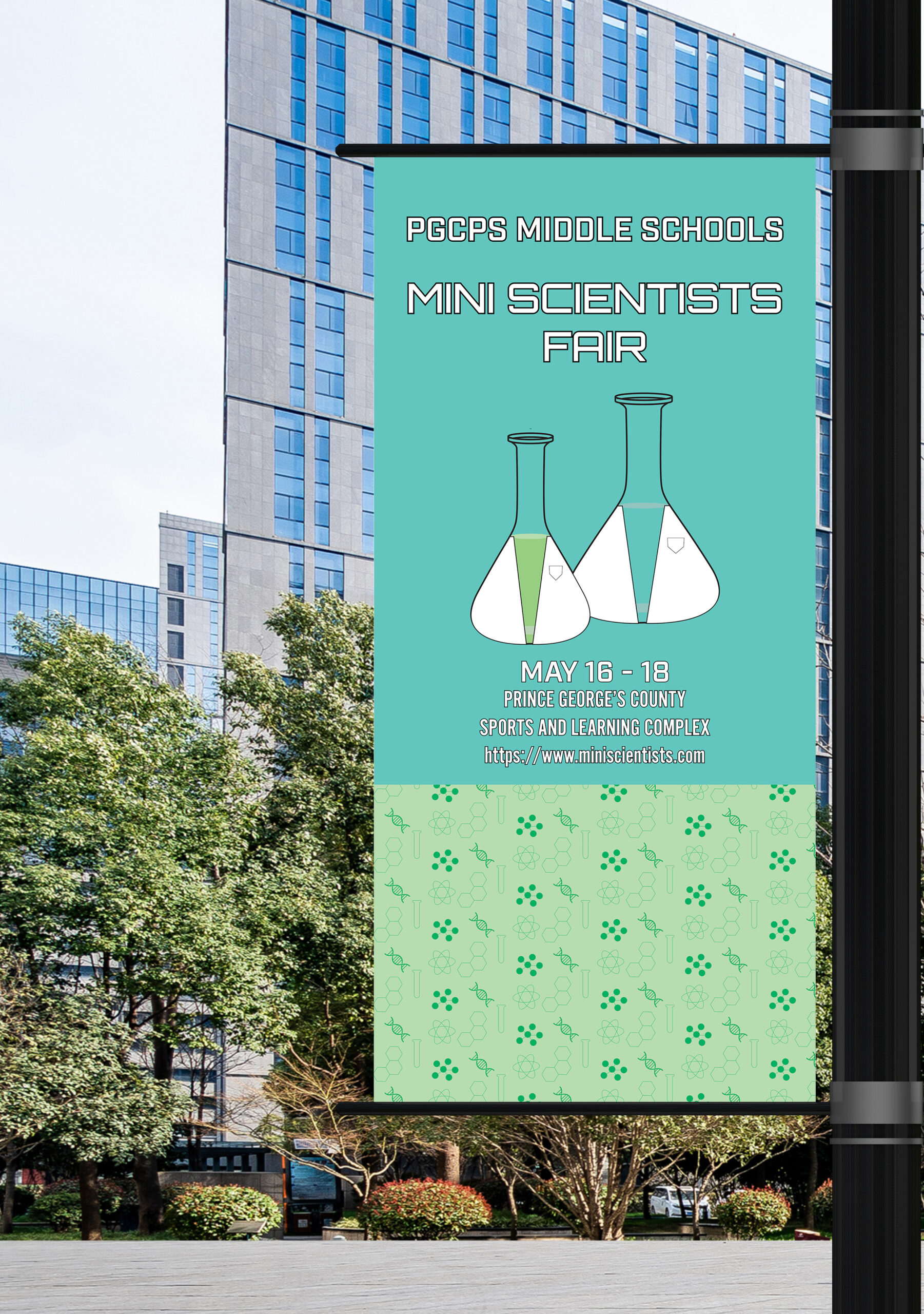
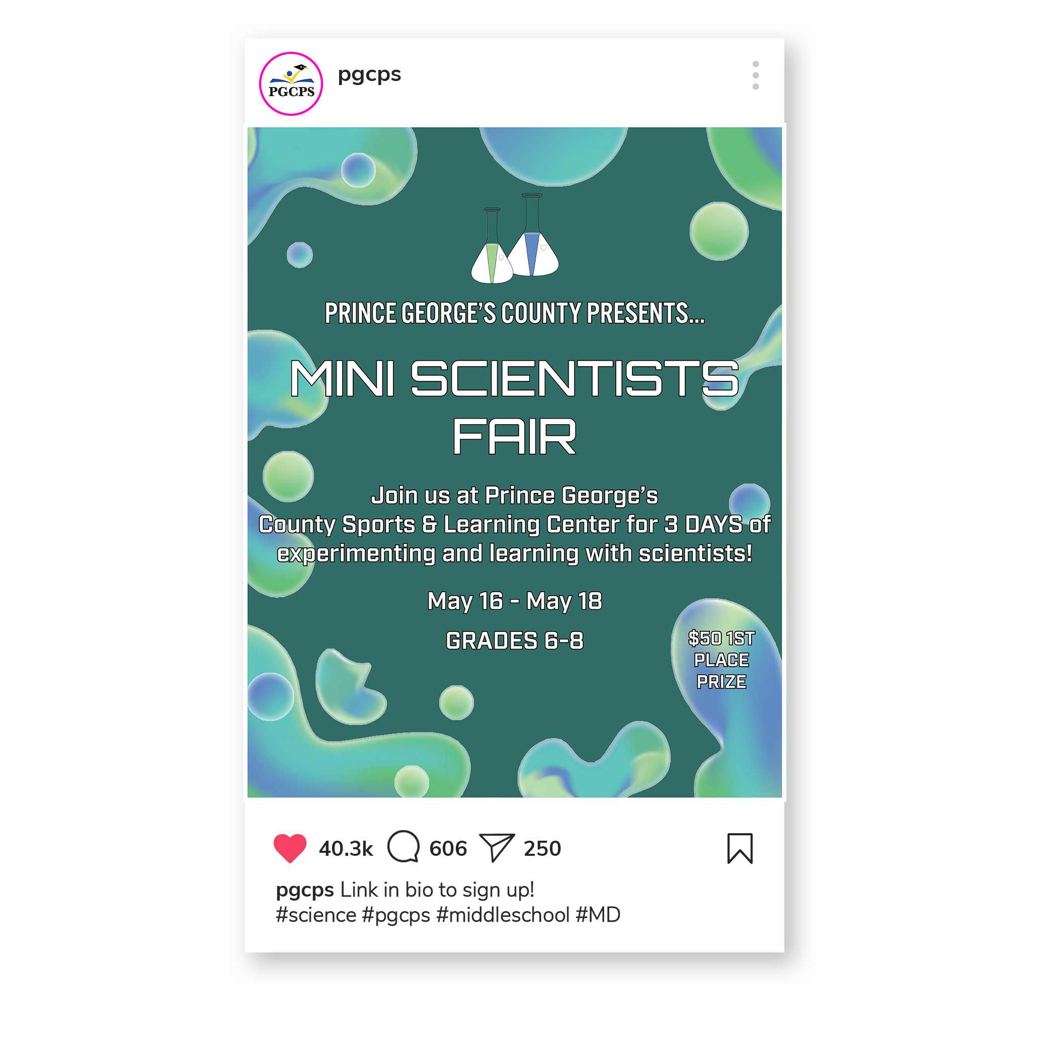
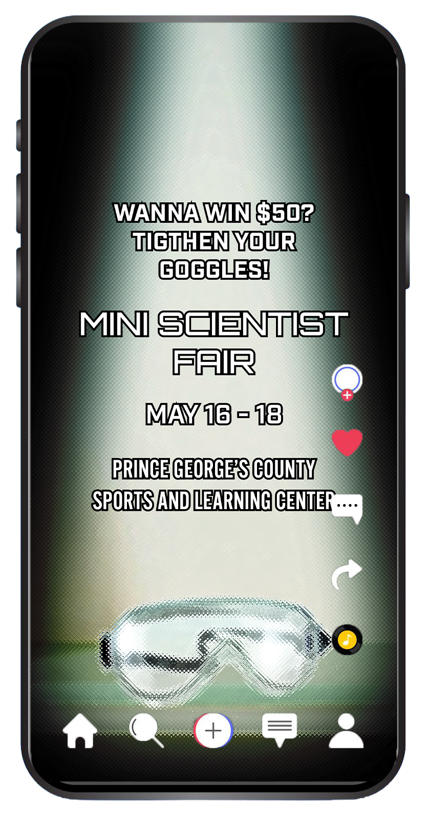
With such a young audience, it was necessary to make the visuals feel as welcoming and clear as possible. Middle schoolers enjoy saturated colors and bold text to better comprehend messages. While considering the palette, I reflected on my experience in primary school and how classes were color-coded. I always associated sciences with green, so I chose various shades of green, a teal, and two blues similar in tone to the greens. A small analogous palette with cool colors helps maintain cohesiveness and students often designate the subject to green whether it be their folders, journals, or dividers. My font choices had a “sci-fi” vibe that would grab the attention of potential attendees as it associates the learning experience with the imaginative and explorative nature of the genre. Even if they’ve never paid attention in class or had an interest in research, most children have interacted with a science fiction book, movie, or video game.
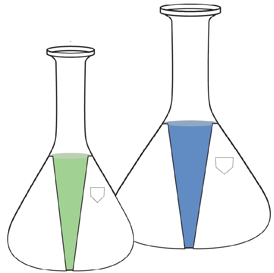
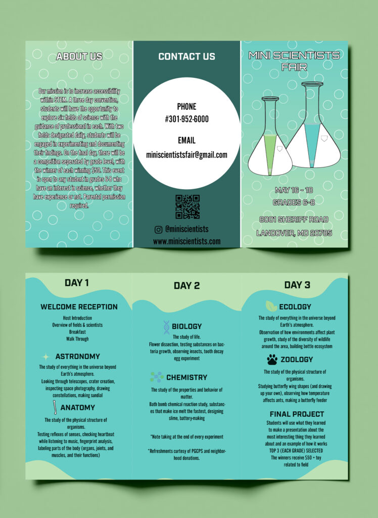
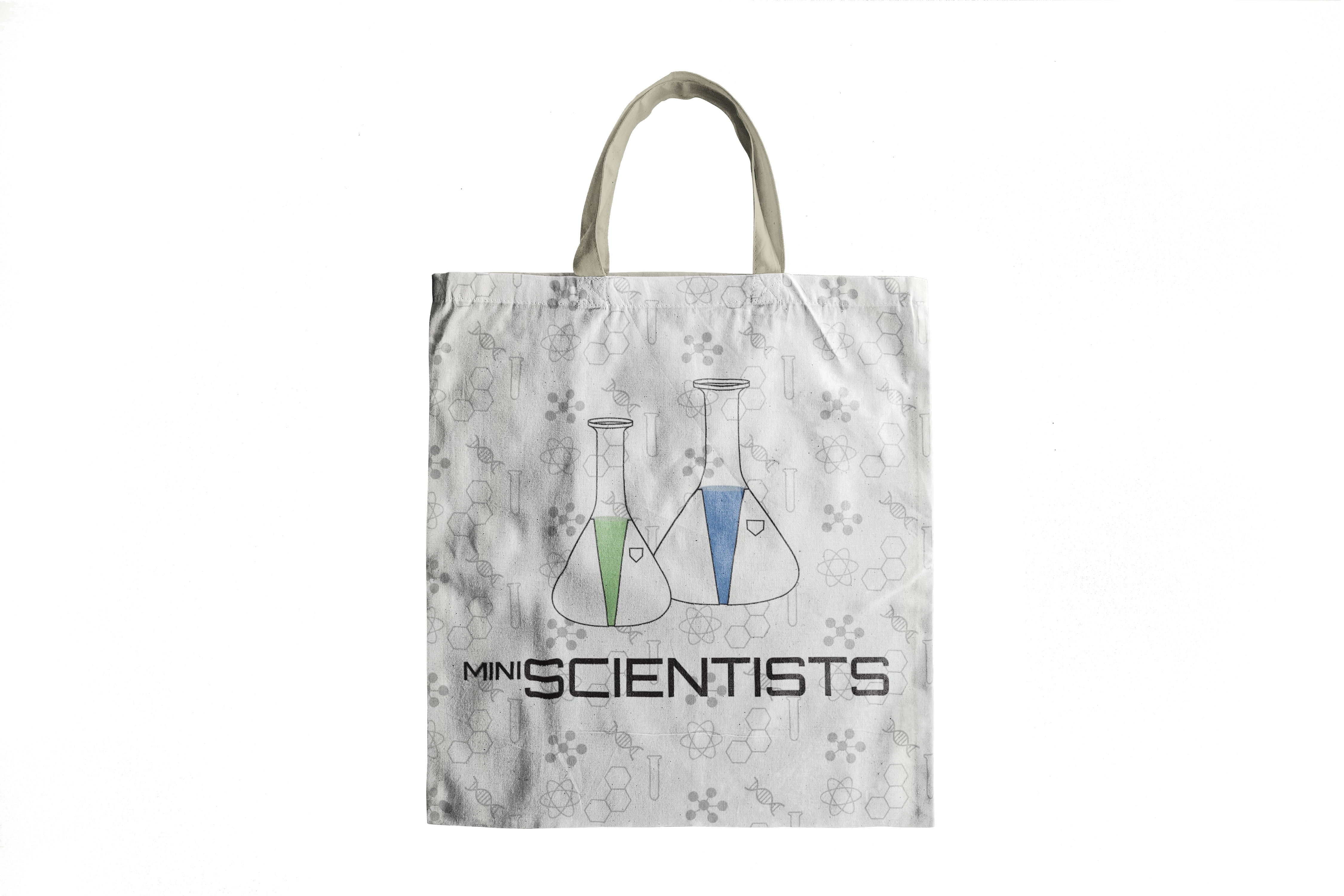
Continuing the idea of straightforwardness, I went for the most recognized symbol of science, test tubes. To complement the logo, many of the deliverables had bubbles in reference to chemical reactions. As a collaborative event between professionals and students, I differentiated the two via scale. The tube in the foreground is both shorter and thinner for children, and the one in the background is wide and tall to represent the adults. With two categories each day, the first thing that came to mind was what is the quickest way for students to understand what they’re learning. Immediately, I made symbols of the general idea behind each field. Students might not know every word or feel like reading the descriptions, but their minds can get the gist of it when it is reduced to a simple icon.
Branded Collateral
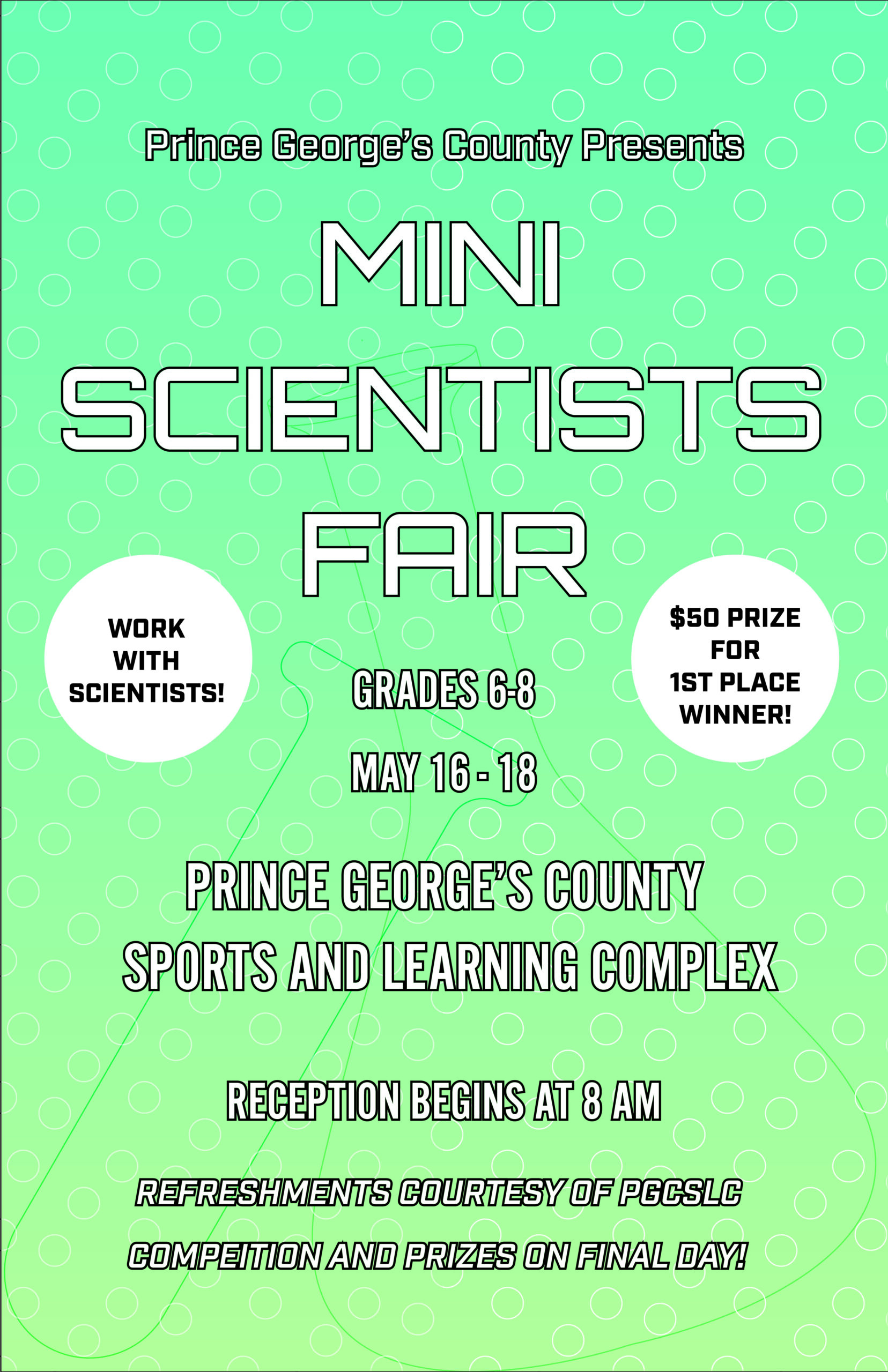
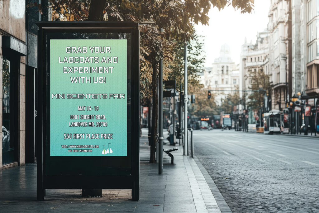
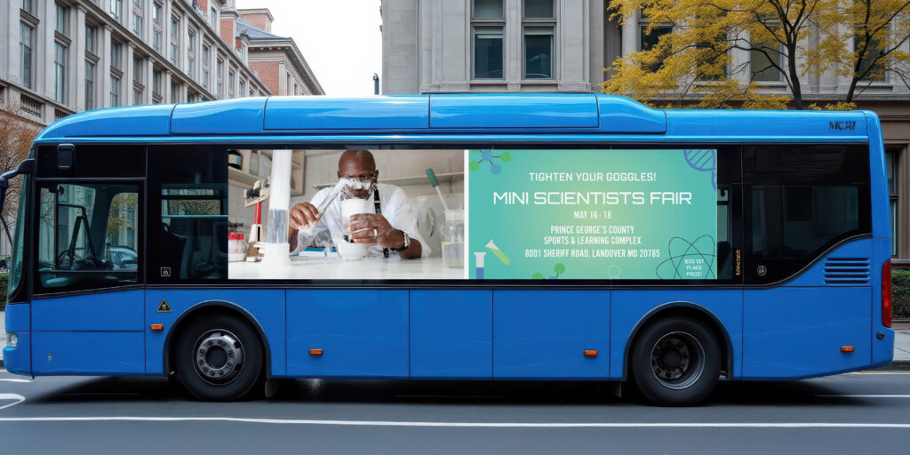
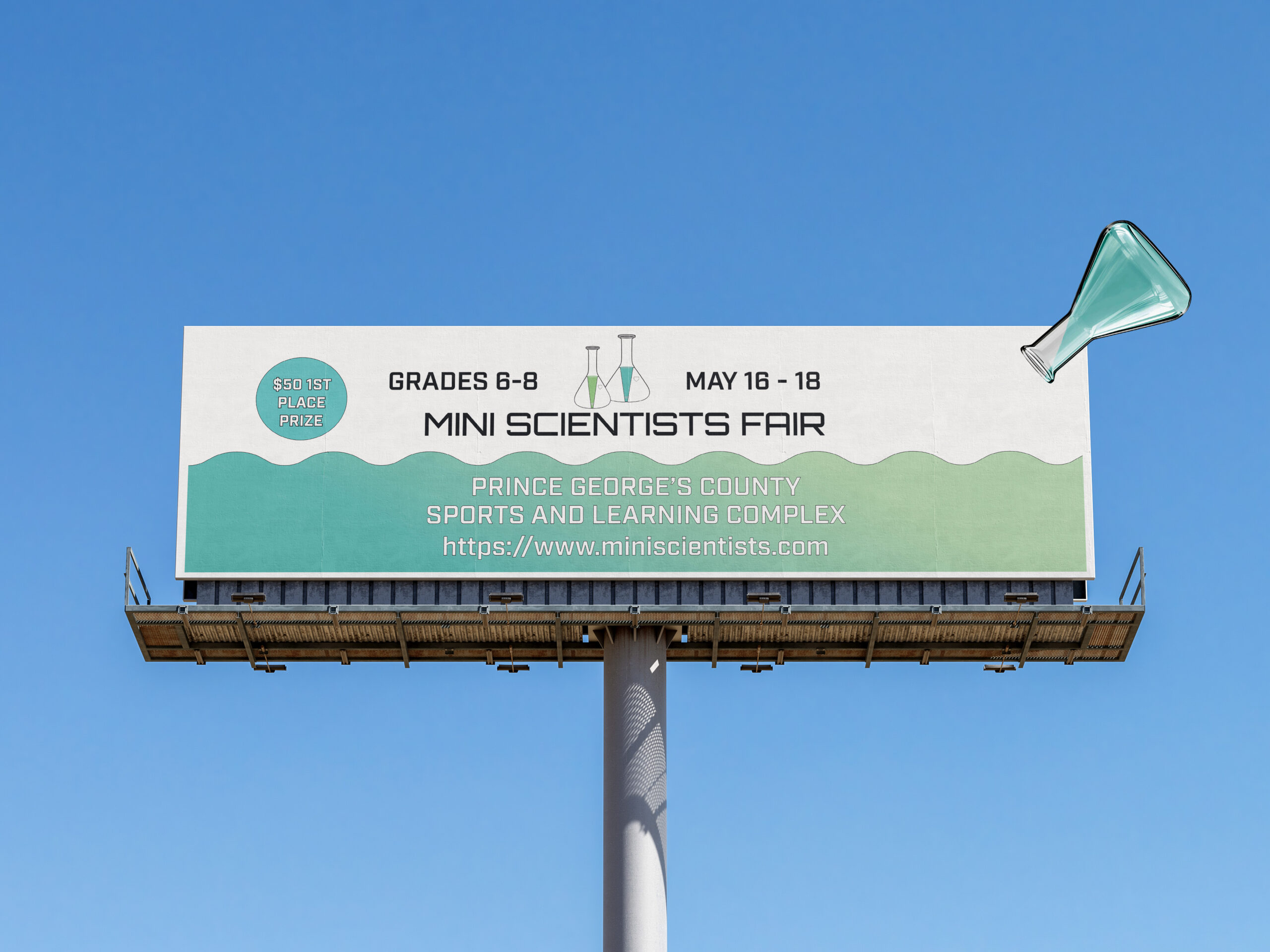
Marketing Package

Merchandise
Website & Companion App
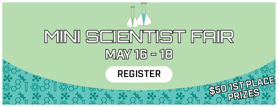
For my website, the landing page features a mission statement, schedule, overview of attendees, registration, and a contact footer.
For my app, there are 5 pages: home , agenda, event, profile, and informational.