SOUR POWER SORTZ REDESIGN

Sour Power Sortz Redesign Case Study

Brief

For this assignment, we selected an off-brand or poorly designed product to redesign the packaging for a new audience. I chose Dorval Trading Co.’s Sour Power Sortz as I felt the highly saturated colors and inadequate spacing could be improved on.

Overview

2025

University Assignment 

Packaging Design

Logo/Packaging Redesign

Sketches

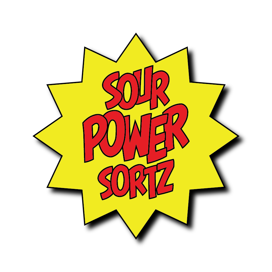
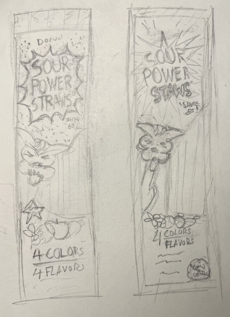
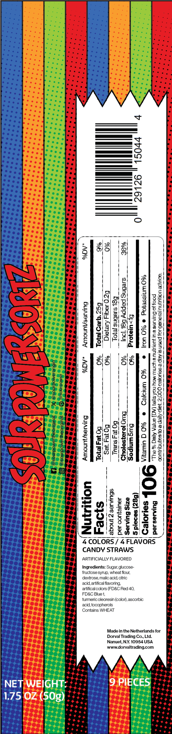
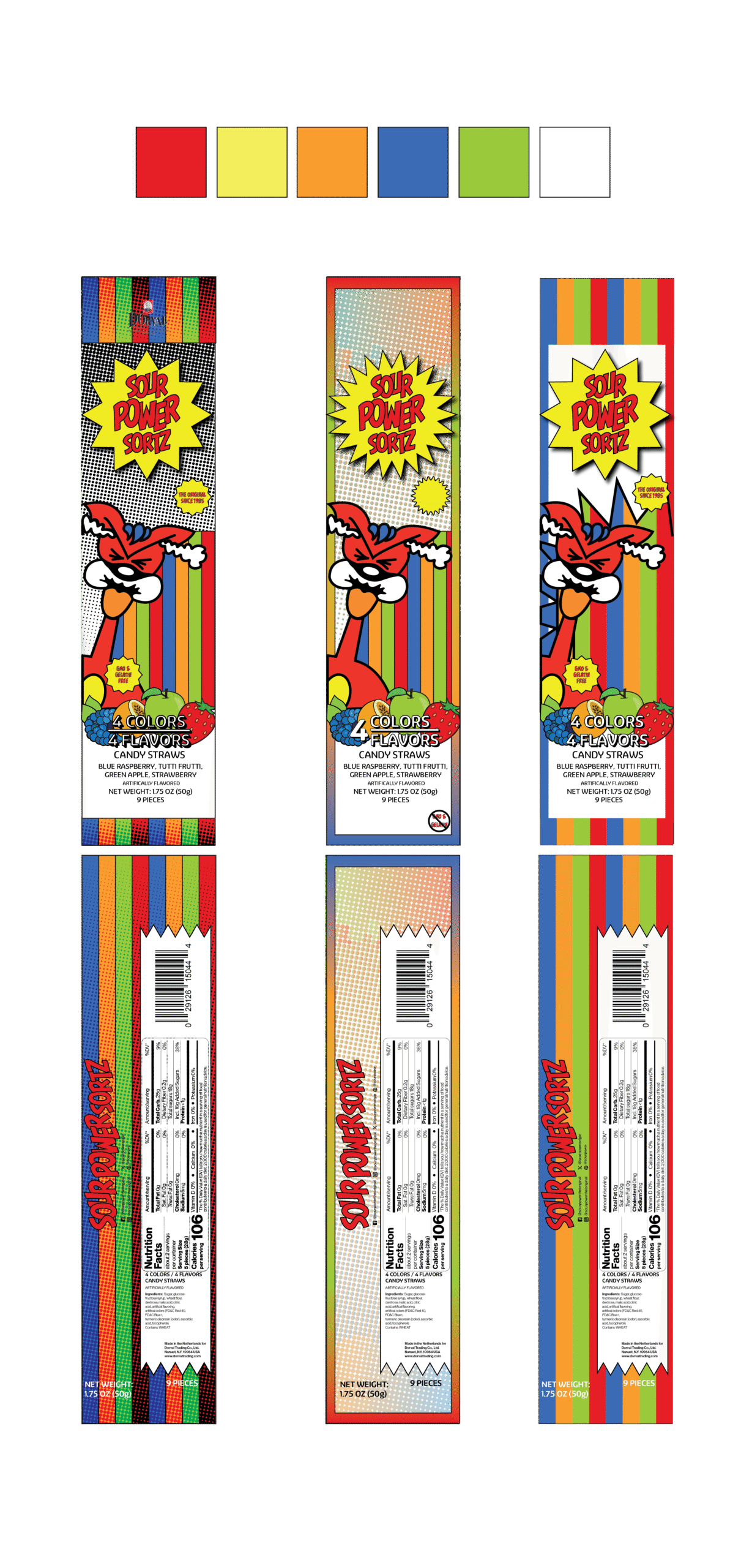
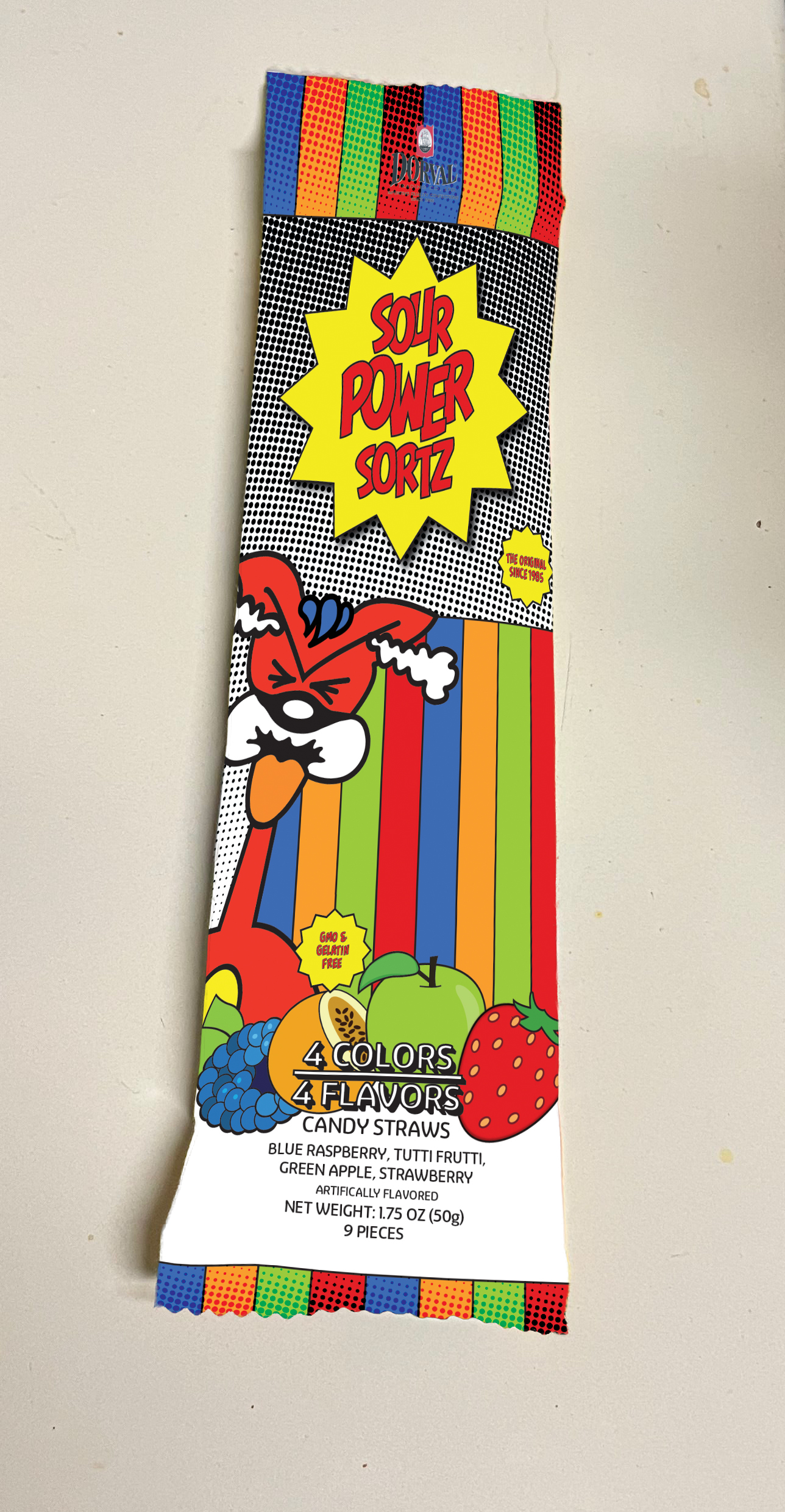
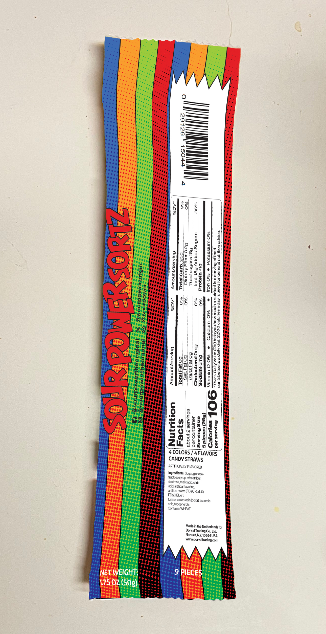
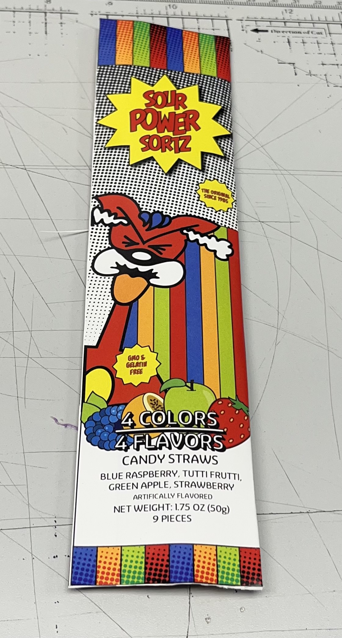
My first sketch includes dots to represent a halftone pattern behind the title and a symmetrical version of 

the explosive text box that doesn’t extend off the sides. Instead of bold lines, the pattern dominates the package, and the lines are reserved for the top and bottom lining. 

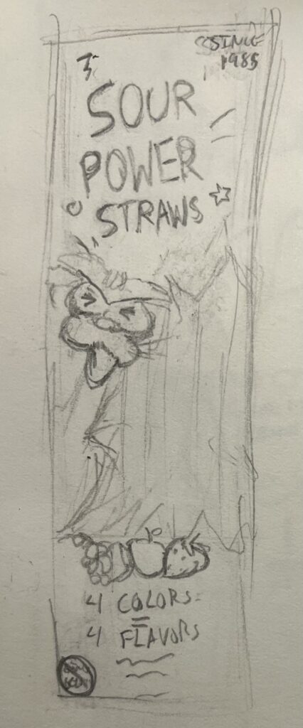
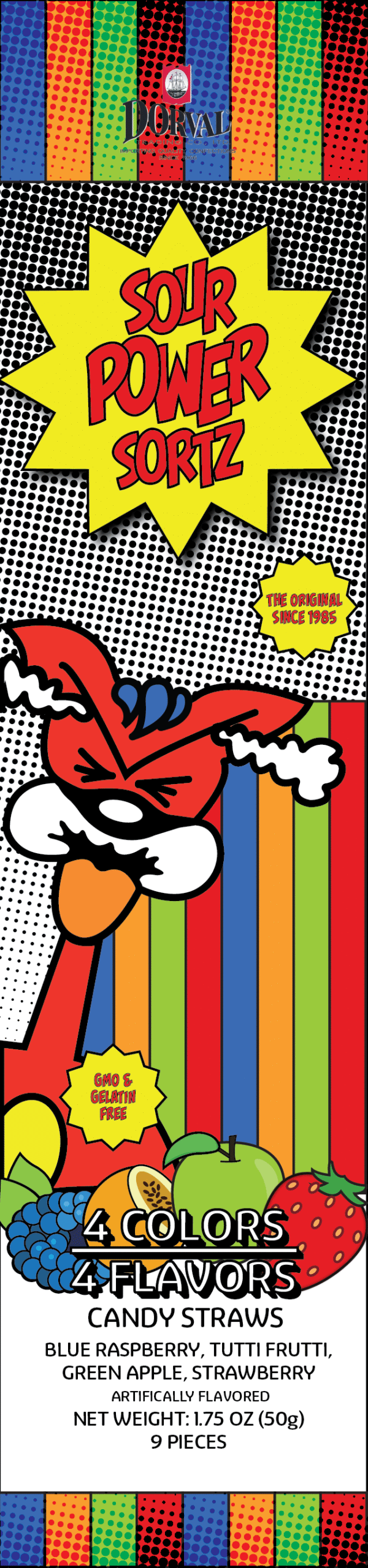
I also changed the arrangement of the “4 Colors/4 Flavors” text, instead having them stack center-aligned. My second sketch shifts the lines into a border around the bag and displays the 4 Colors texts as a mixed fraction. My last sketch drops the explosion text box completely and instead incorporates that as the transparent section 

to reveal the straws.

Two sketches of my packaging redesign for Sour Power Sortz
Sketch for my packaging redesign of Sour Power Sortz

Digital Flats

As all the designs were similar, my professor suggested I digitize all three. I decided on my first sketch as my final because it felt balanced yet interesting to look at. Initially, the halftone wasn’t going to be applied to the colored lines, but I liked the texture it added. Since I completely changed the bottom text, I redrew each fruit, as they weren’t tucked behind the text as much. In my initial sketches, I forgot to sketch the back, but the only changes I made were changing the websites to social media handles and increasing the size of the text.

Mockups (Digital + 3D)

My packaging didn’t allow for a premade mockup, so I improvised and took pictures on my stovetop. Since I had to make my own blank packaging, I selected my bag and overlaid it in white. Then I made a rectangle slightly bigger than the bag, converted it into a smart object, and warped it to conform it to the contours. From here, I simply put in my image files and clipped them to the white layer below. For my 3D mockup, I added half an inch of white space to fold the packaging. Then I glued the space and the inside of the front to seal it. Then I added a bit of glue to the top and bottom parts of the package to mimic the original. My goal for this redesign was to organize the chaos. I didn’t feel that the design or branding itself was poor; it just needed to be executed better. I adjusted spacing throughout texts and imagery to provide breathing room, included a halftone texture to maintain the “comic book” feel, and rearranged the description of colors and flavors to reduce clutter.